


Most DTF transfers are printed using a standard RGB workflow. That’s fine for screens. It’s not ideal for fabric.
At JoesDTF.com , transfers are printed using RGBO: Red, Green, Blue, and Orange. That extra orange channel is not a gimmick. It’s the reason our prints look warmer, richer, and more alive the moment they’re pressed.
Here’s why that matters…
RGB was designed for light. Your phone, your laptop, your tablet… they all create color using red, green, and blue light. But DTF printing uses ink, not light. When RGB artwork is converted for print, especially in the warm spectrum, subtle compression happens. Reds lose depth. Oranges dull out. Golds flatten. Skin tones can shift slightly pink or slightly gray.
Most people can’t explain why a print looks “off”. They just feel it.
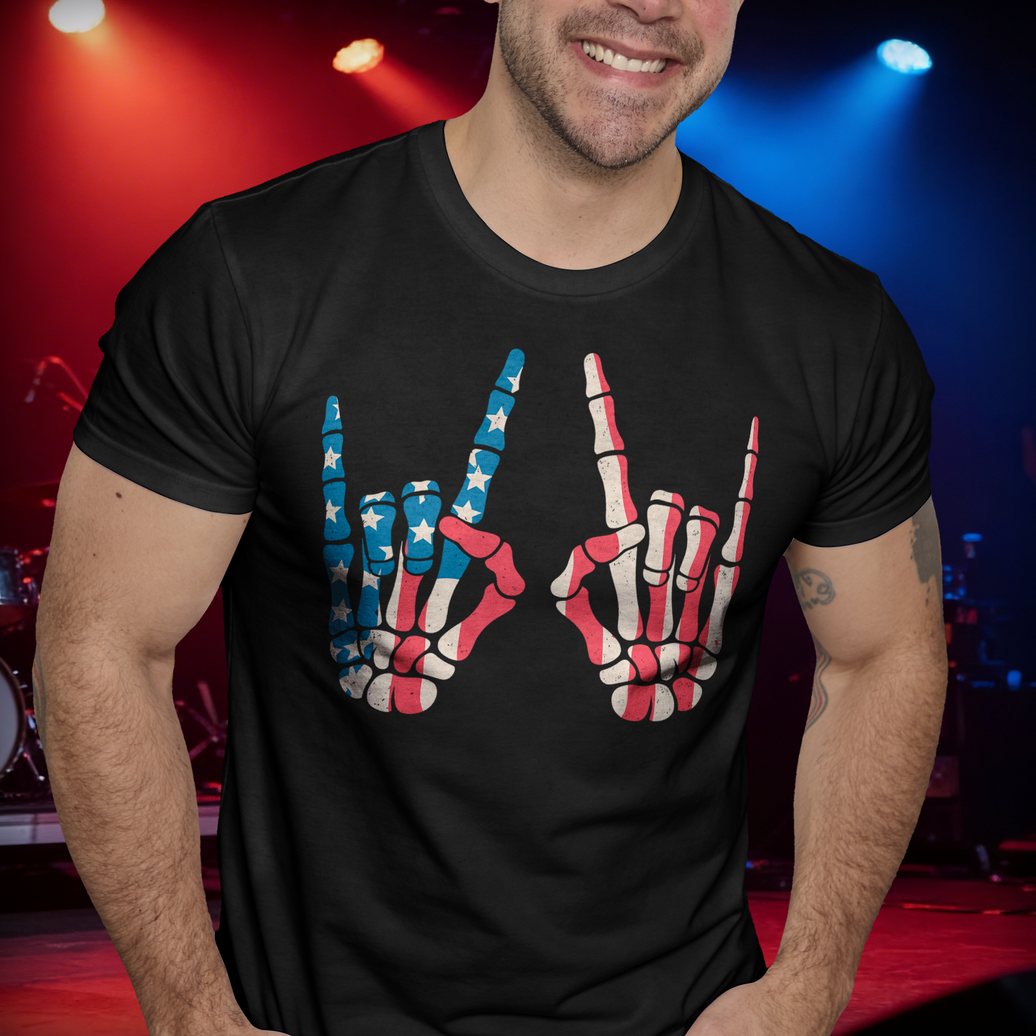
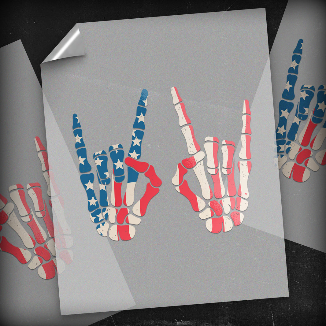
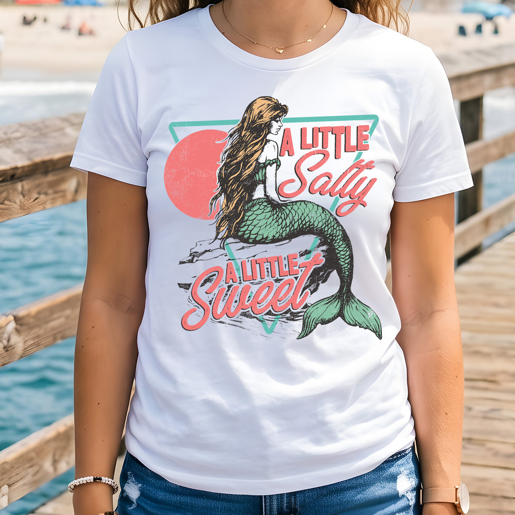
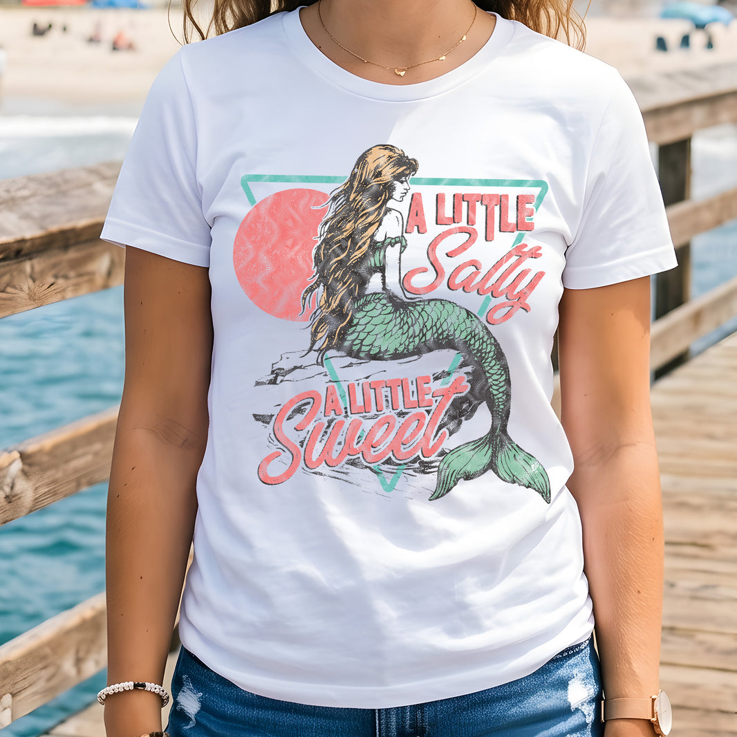
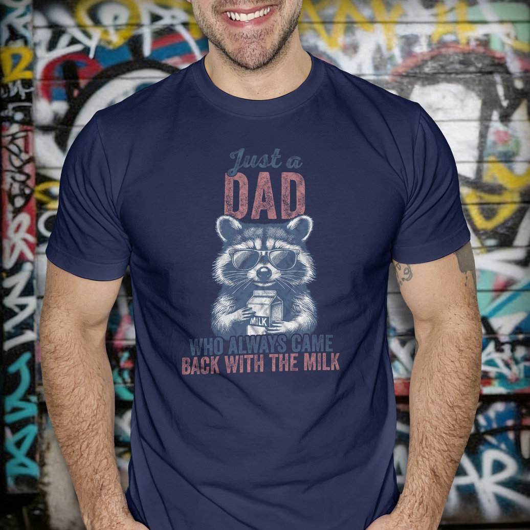
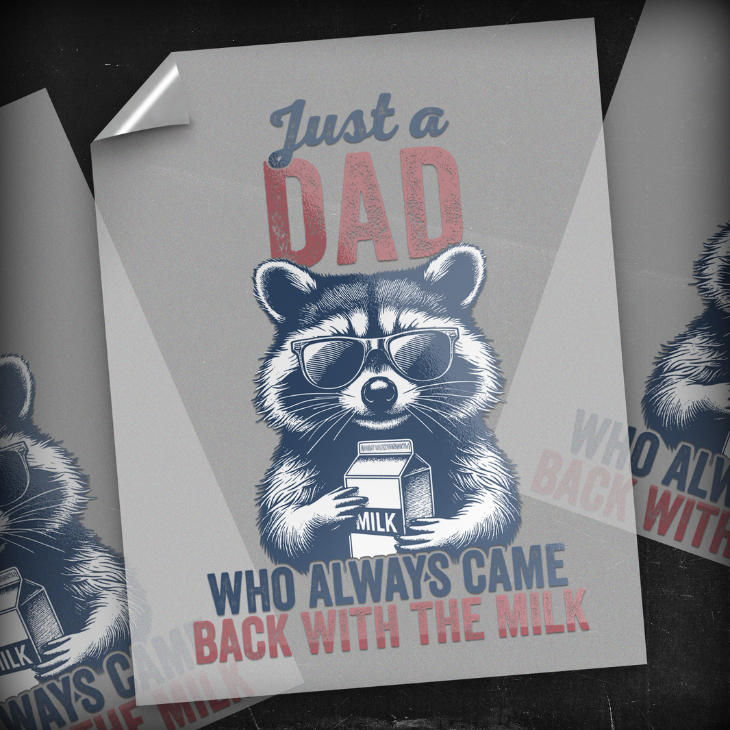
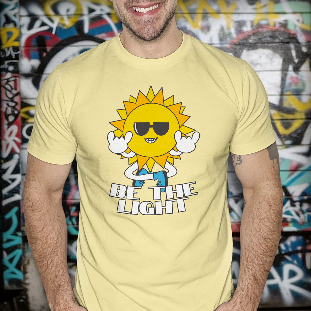
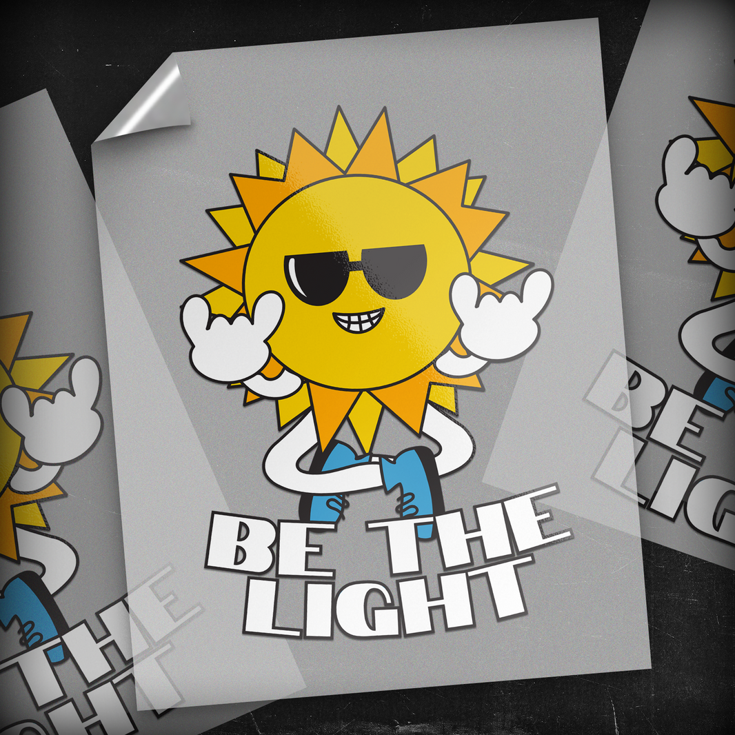
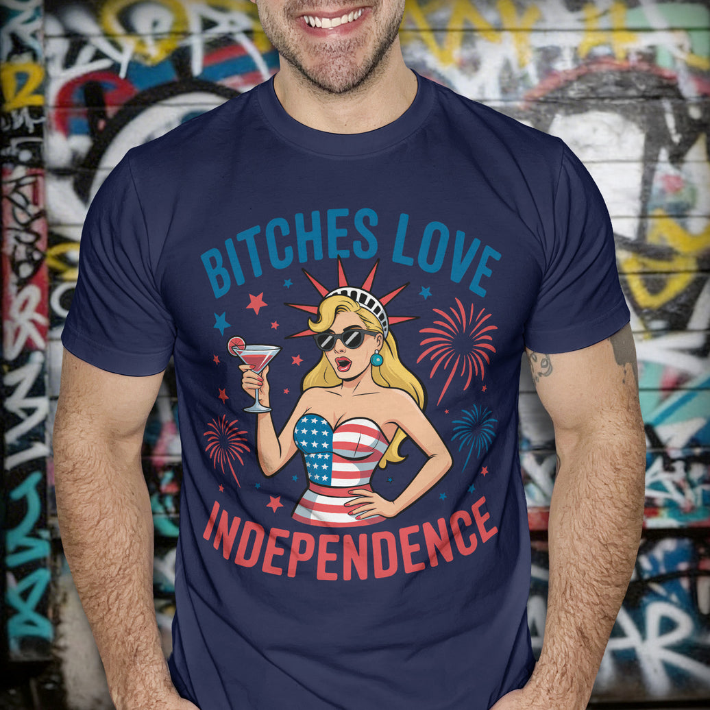
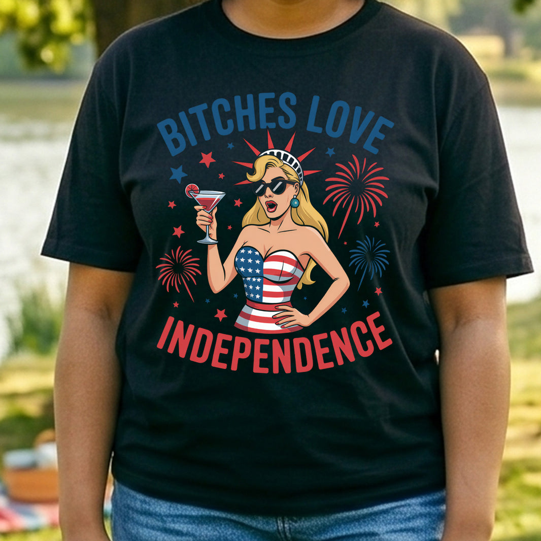
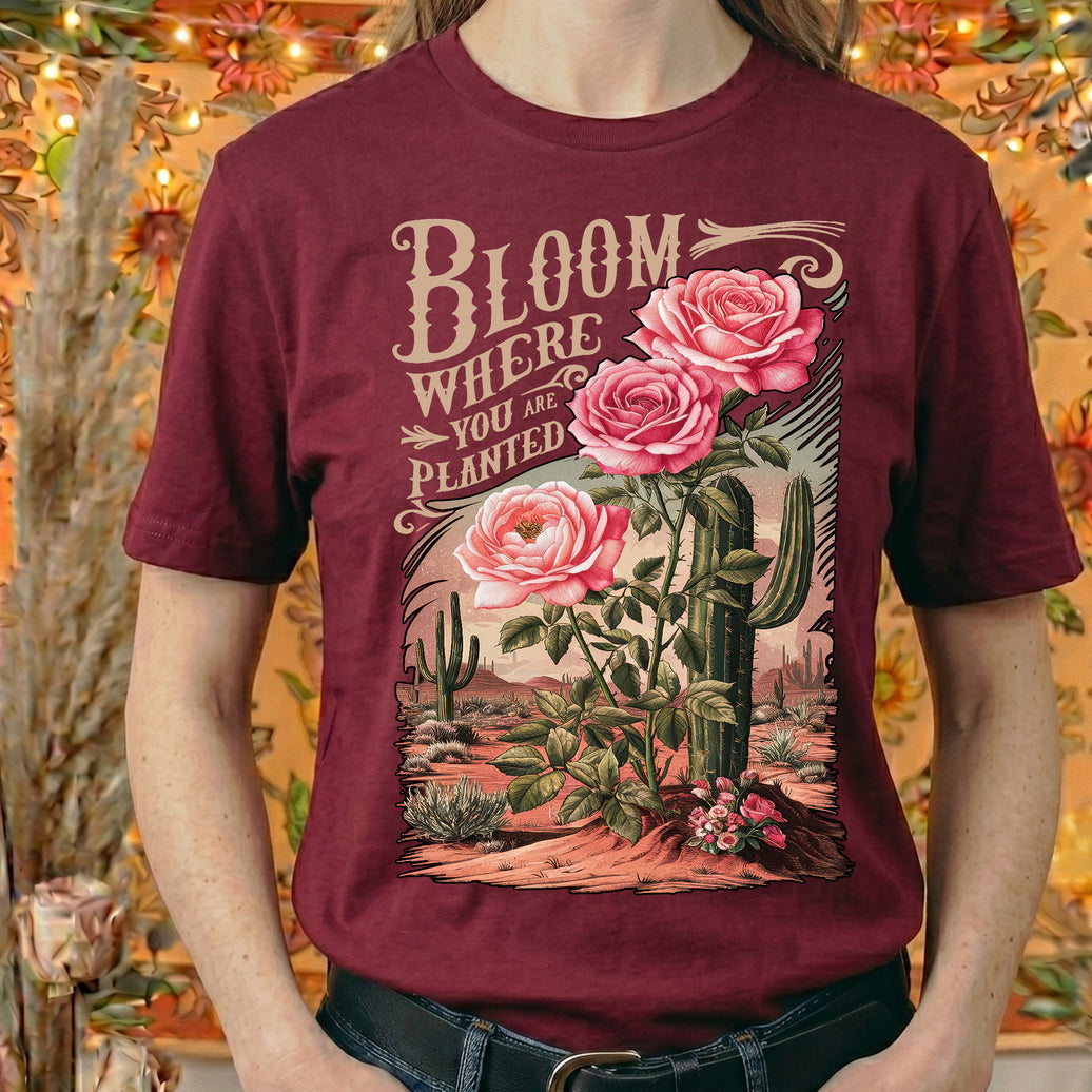
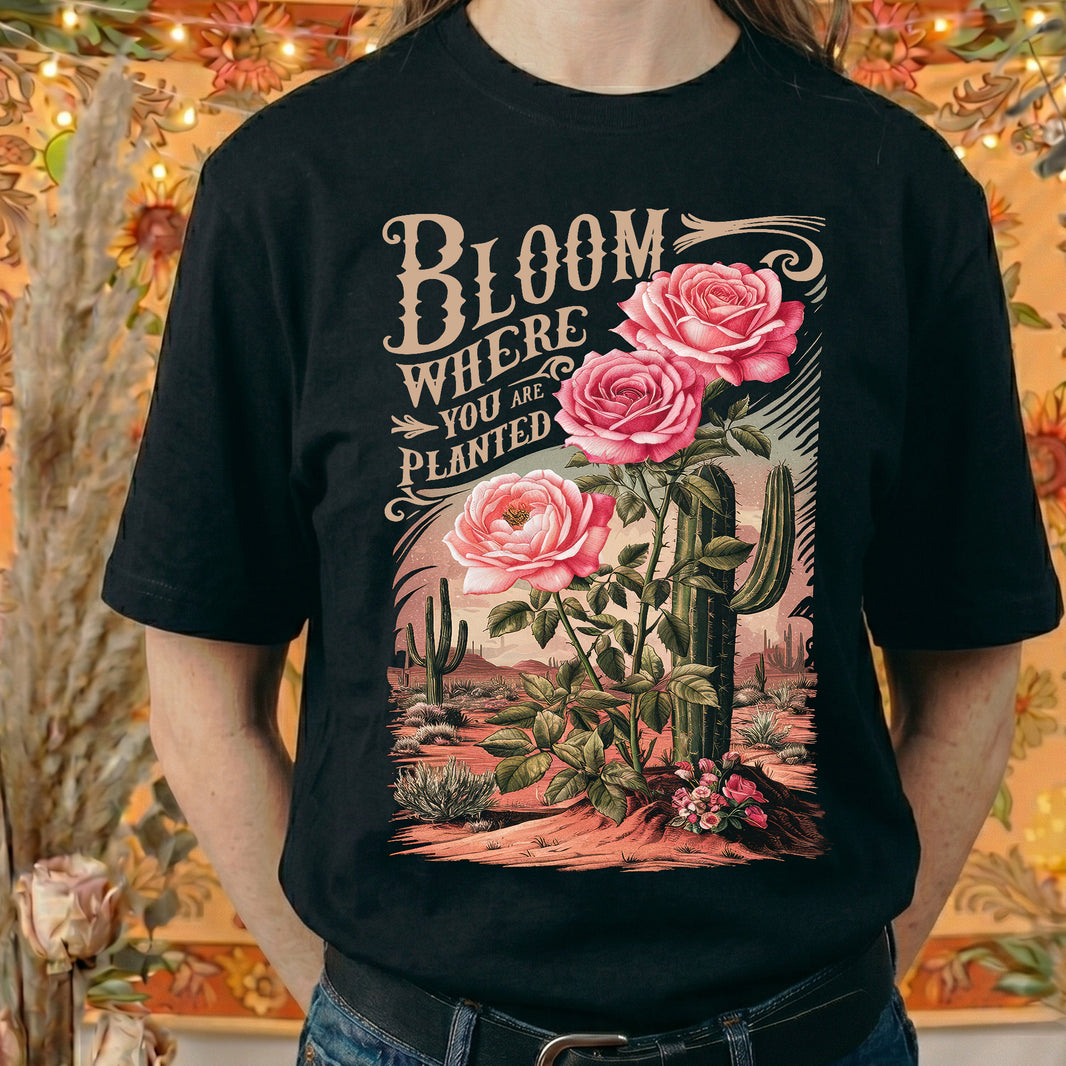
Adding an orange channel expands the printable color gamut exactly where apparel designs need it most: the warm tones. Fire graphics. Sunsets. Sports logos. Gold lettering. Portraits. Retro gradients. These all rely heavily on orange-based warmth. Instead of blending red and yellow to approximate those hues, RGBO hits them directly. The result is deeper reds, cleaner oranges, smoother gradients, and more accurate skin tones.
The difference isn’t cartoonishly dramatic. It’s refined. And refinement is what separates average prints from premium ones.
When a design prints closer to what you see on screen, your brand looks more intentional. Colors feel confident instead of slightly muted. Gradients flow instead of banding. Highlights glow instead of looking flat. That consistency builds trust with your customers, even if they don’t know why your prints look better.
More color control means more emotional impact. And color is emotional. Deep red feels powerful. Warm orange feels premium. Golden tones feel elevated. When those hues are reproduced correctly, the garment doesn’t just look good… it feels finished.
That’s why JoesDTF prints in RGBO.
Not because it sounds advanced. Not because it’s trendy. But because it produces transfers that look the way they were meant to look.
In an industry where everyone is competing on price, precision in color is a quiet advantage. And quiet advantages are what build strong brands.
Keep being a rockstar! 🤘
-Joe